Cubby
App Development
Overview
Cubby is a mobile app concept designed for new and soon-to-be parents searching for infant, daycare, and preschool care. The platform brings school discovery, applications, waitlist tracking, and tour scheduling into one streamlined experience, reducing the need to compare information across multiple websites.
The Problem
Parents often navigate fragmented websites, outdated contact information, unclear waitlists, and inconsistent application processes while trying to secure childcare. Research participants opened multiple tabs, struggled to compare facilities, and sometimes abandoned the search entirely. Cubby was designed to make this process more organized, transparent, and manageable.
-
Product Designer
-
Individual Academic Project
-
Four weeks
-
Illustrator | Figma
-
UX Research | Contextual Inquiry | Information Architecture | User Flows | Wireframing | UI Design
Goals
Centralize childcare information in one app
Help parents compare schools using meaningful filters
Make wishlist and application progress easier to track
Allow users to request tours without leaving the platform
Reduce stress through simple navigation and clear next steps
Research
Contextual Inquiry
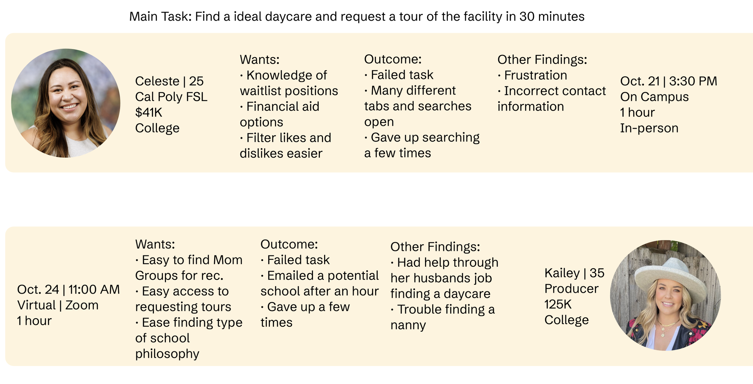
I observed two parents attempting to find an appropriate childcare facility and request a tour within 30 minutes. Both participants struggled to complete the task, opened multiple websites, encountered inaccurate information, and became frustrated with the lack of clear filters and waitlist details. Their experiences revealed a need for a centralized platform that supports the entire childcare search process.
Key Insights
Parents needed accurate contact and facility information
Waitlist visibility was a major concern
Existing searches required too many tabs and websites
Users wanted filters for budget, philosophy, care type, schedule, and support needs
Tour requests and applications needed to be easier to cpm[lete
Defining the Experience
Empathy Map
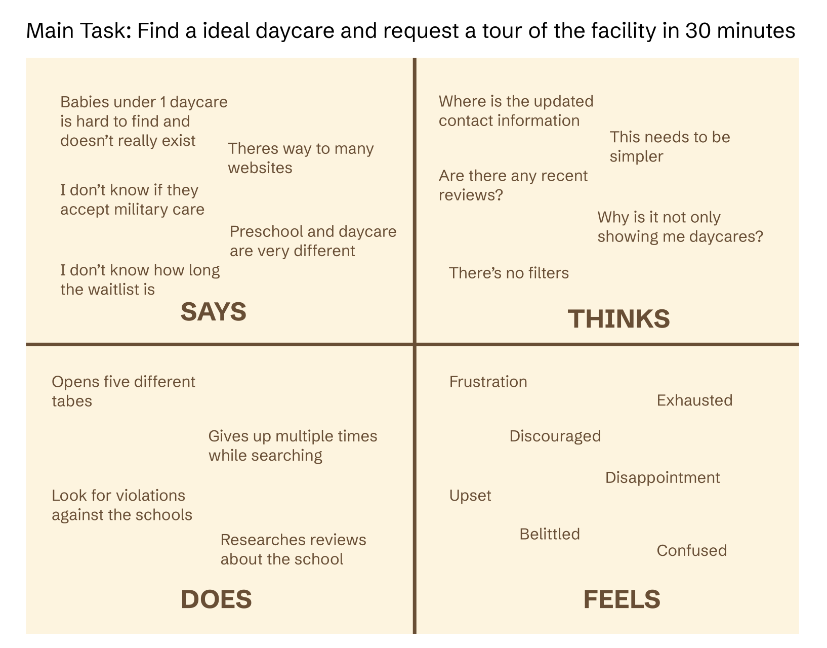
The empathy map highlighted the emotional weight of the childcare search. Participants described feeling frustrated, exhausted, discouraged, and confused while trying to evaluate schools and determine availability. These findings shaped Cubby’s emphasis on clarity, transparency, and reduced cognitive load.
Feature Prioritization
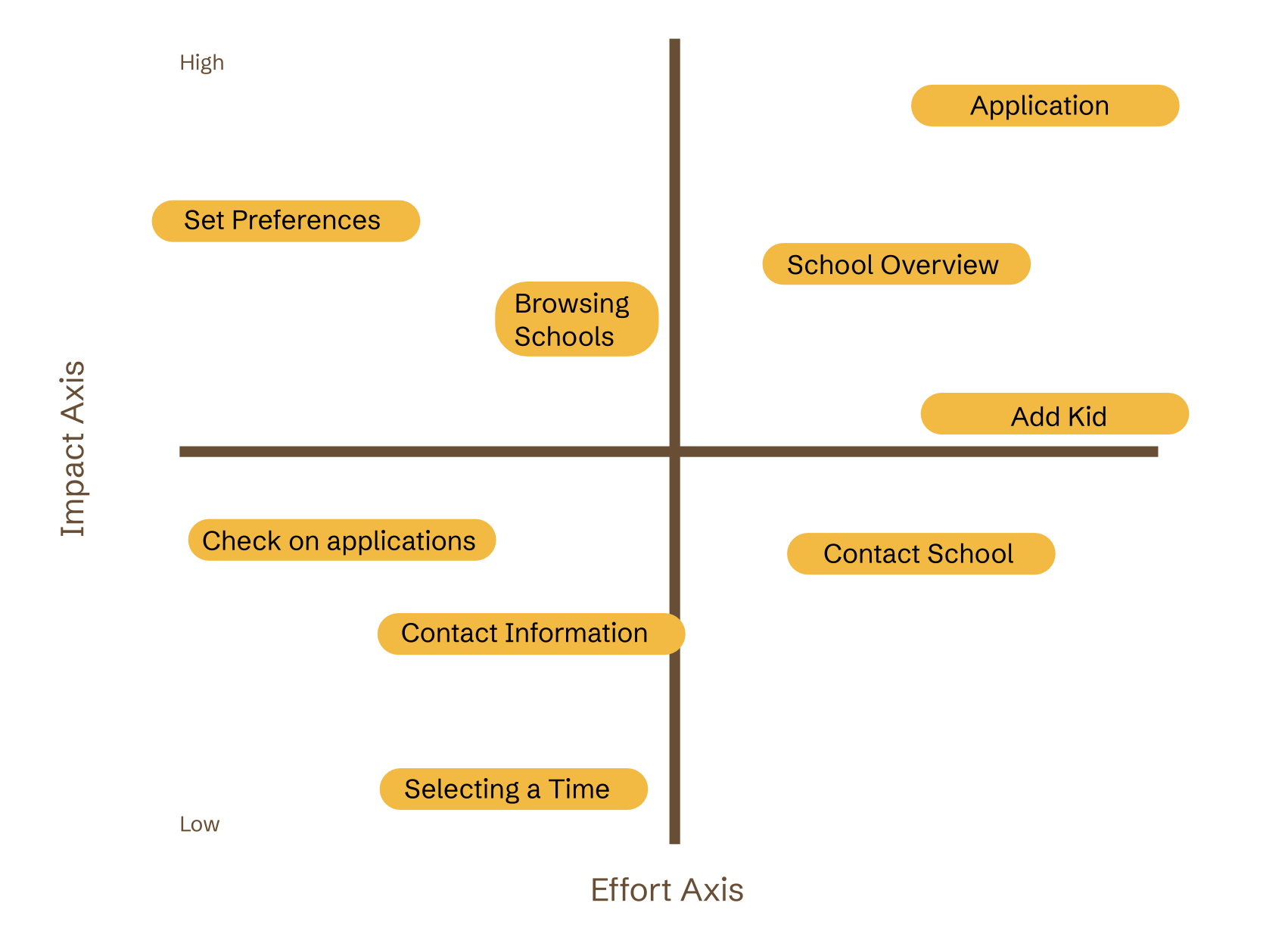
An impact-effort matrix helped identify the most valuable features, including preference settings, school profiles, applications, child profiles, and tour scheduling. This allowed the product to focus on actions that would have the greatest impact on parents while keeping the experience manageable.
Task Flow
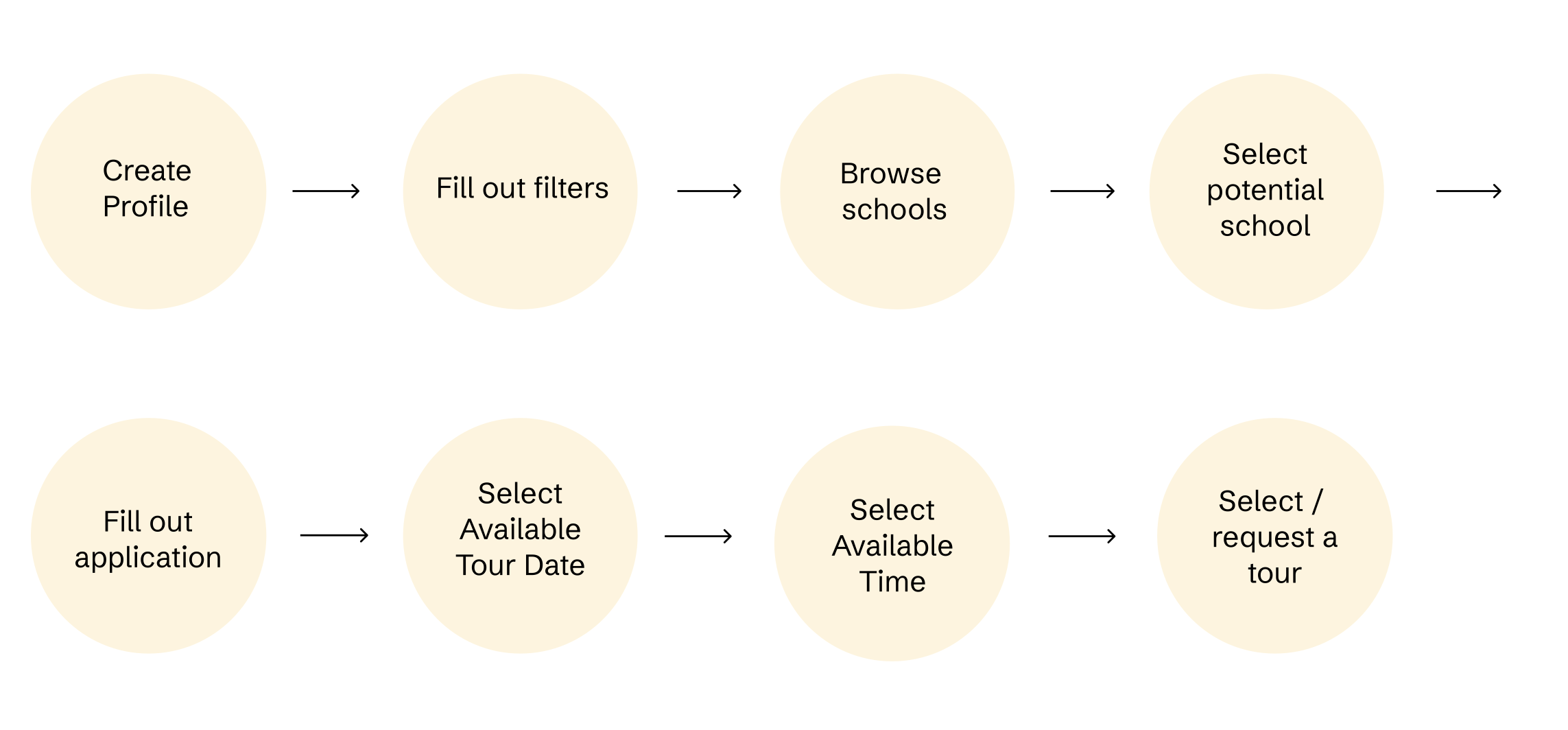
The primary task flow guides users from creating a profile and setting preferences to browsing schools, submitting an application, and requesting a tour. The goal was to create a clear progression that keeps each step connected within one app.
Final Design
Visual Design
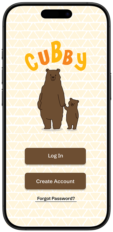
Cubby uses warm yellows, oranges, browns, rounded forms, and playful bear imagery to create a welcoming and child-centered personality. Although parents are the primary users, the visual system reflects the care, warmth, and optimism associated with early childhood. Large buttons and simple layouts were used to keep the interface approachable and easy to navigate.
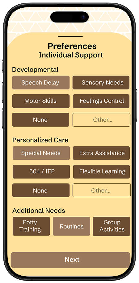
Personalized Preferences
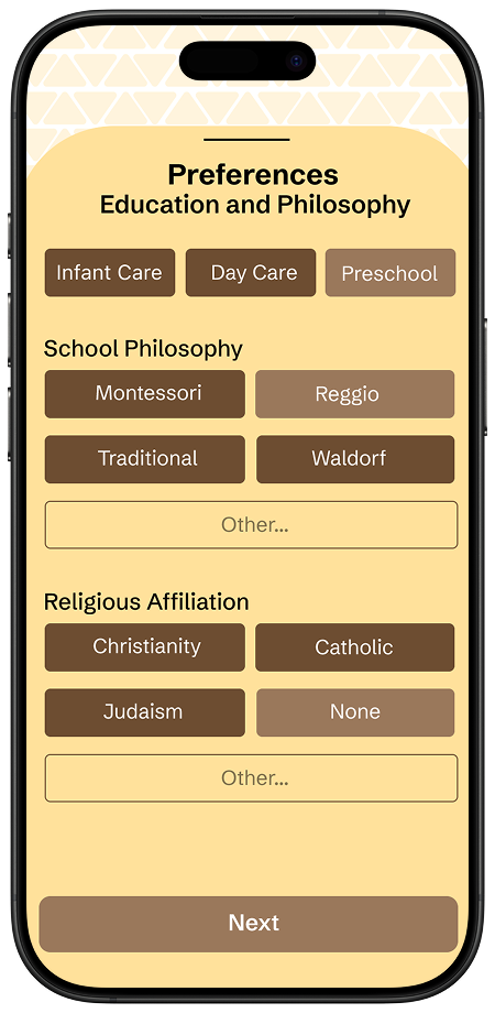
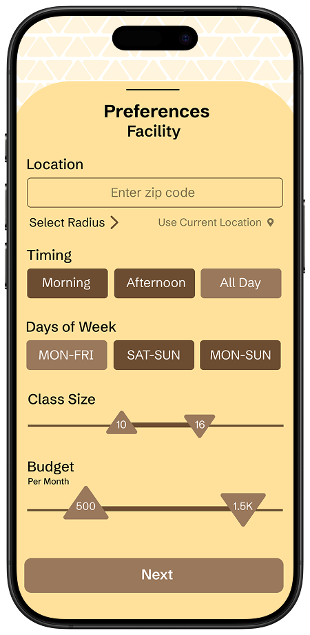
Cubby begins by gathering information about location, budget, schedule, educational philosophy, care type, class size, and individual support needs. Breaking preferences into focused steps helps parents build a personalized search without facing one long, overwhelming form.
Offers
Progressive setup
Flexible care preferences
Budget and schedule controls
Support-needs customization
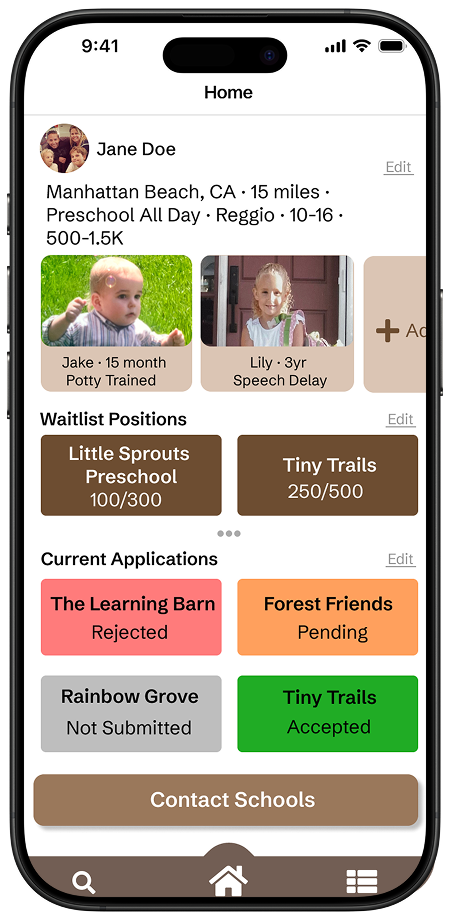
Parent Dashboard
The home dashboard provides an overview of child profiles, active waitlists, current applications, and recommended schools. This gives parents one central place to track progress and quickly return to important tasks.
Offers
Waitlist tracking
Application status
Child profiles
Personalized recommendations
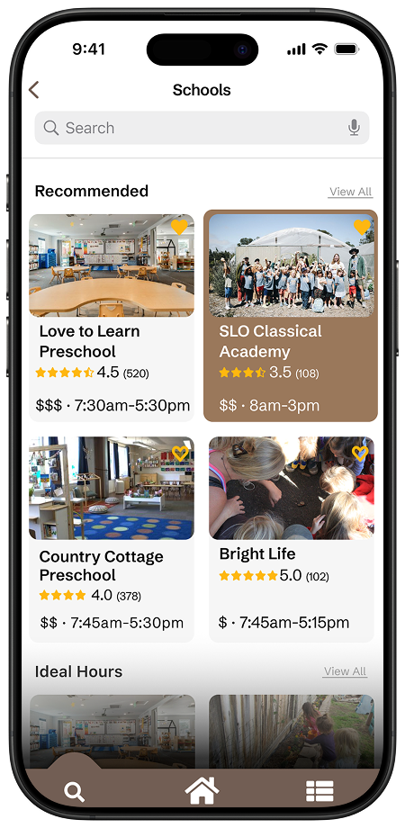
School Discovery
Search results combine school imagery, ratings, distance, pricing, operating hours, and care type into scannable cards. This makes it easier for parents to compare facilities without opening several websites.
Offers
Recommended schools
Search and browse
Quick comparison
Key information at a glance
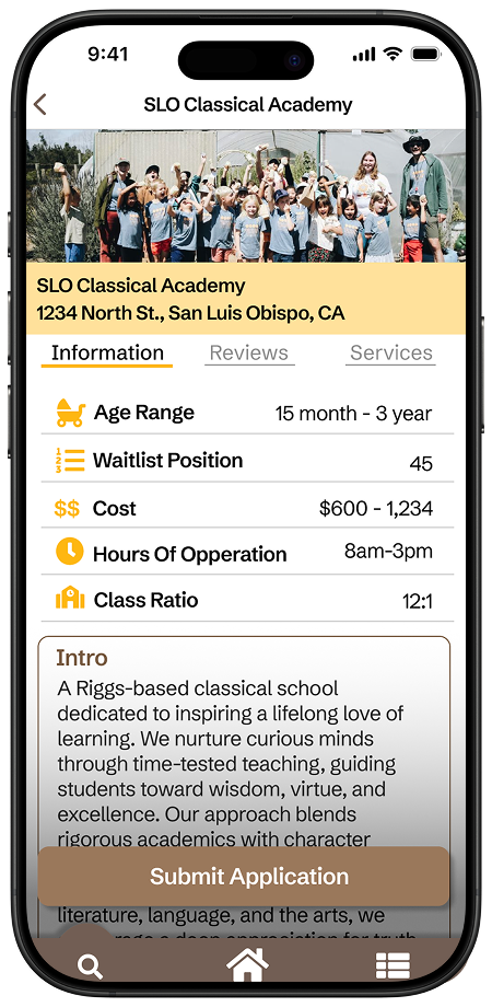
School Details and Applications
Each school profile consolidates essential information such as age range, waitlist position, tuition, hours, class ratio, reviews, and educational philosophy. Parents can move directly from research to submitting an application within the same experience.
Offers
Centralized school information
Transparent waitlist data
Application access
Clear decision support
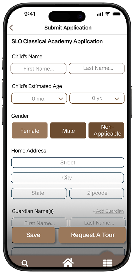
Tour Booking
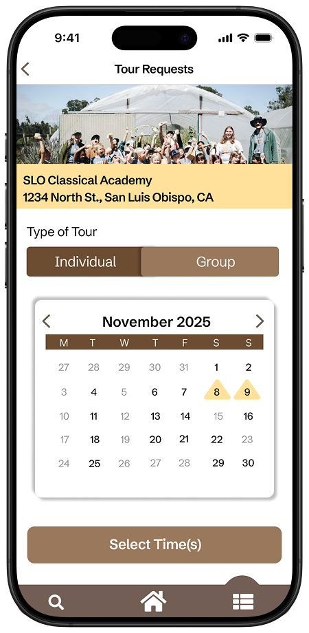
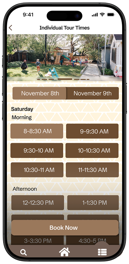
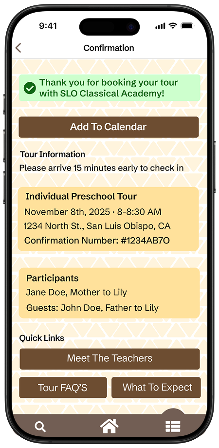
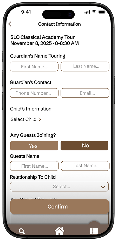
Cubby allows parents to select a tour type, date, and available time directly through the app. A confirmation screen summarizes the appointment and provides quick links, reducing the back-and-forth typically required to arrange a visit.
Offers
Calendar-based scheduling
Individual or group tours
Available time selection
Appointment confirmation
Reflection
Cubby strengthened my ability to translate real user frustrations into practical product features. Conducting contextual inquiries showed me how fragmented and emotionally demanding the childcare search can be, while the design process challenged me to simplify a complex journey without removing important information. This project reinforced the value of clear navigation, thoughtful feature prioritization, and designing for users who may already feel overwhelmed. Most importantly, it taught me that a successful product should not only help users complete a task, but also make the process feel more transparent, reassuring, and manageable.